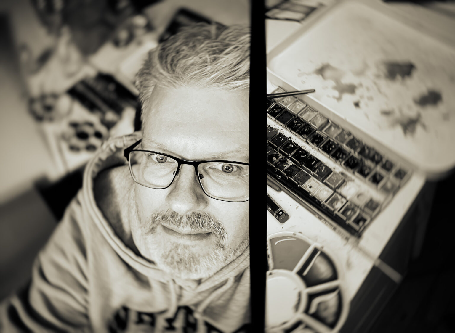
With a background in technical illustration, Mattias Norén‘s artistic journey has evolved into a passion for creating striking album artwork that resonates with the spirit of the music it represents. From his early days as a student, going through the challenges of education to his eventual rise in the creative realm, Mattias has forged a distinctive path, establishing himself as a sought-after designer in the metal and progressive rock genres.
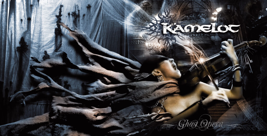
Having collaborated with high-profile bands such as Sabaton, John Petrucci, and Evergrey, Mattias’s work transcends mere design; it captures the essence of each album’s narrative and mood. His approach to art is deeply rooted in his love for music, making each project a personal and transformative experience. In this interview, we delve into Mattias’ creative process, explore the evolution of album art in the digital age, and gain insight into his experiences as both a designer and an artist. Join us as we uncover the story behind the captivating visuals that accompany some of the most memorable music of our time.
You started out studying to become a technical illustrator. What initially drew you to that field, and how did it lead to your eventual work in web design and album covers?
I guess I didn’t have the best grades in the world and then this education appeared that only accepted students based on work samples and not grades. And I had always loved to draw, so I gave it a chance. There were many applicants but I got one of the places. As the name suggests “technical illustrator”, it was mainly about making construction descriptions, CAD drawings and news graphics. I can promise that the whole class could get a job directly at IKEA if we wanted to. But at the same time, this was during the time when the internet really took off and the web agencies were screaming for designers, so I actually think most of the class ended up at web agencies first.
I ended up at a small agency dealing with internet commerce and it grew explosively. Little by little, the company became more and more focused on the technology behind it and not so much on the appearance, and then there were no job for me anymore.
Can you tell us about the transition from working in the web industry to founding ProgArt Media? What motivated you to start your own business creating album covers and graphic services for the music industry?
When I lost my job, I decided to try to make a living from my hobby. I had already gotten a fair amount of cover design jobs by that time and to be able to do it full time was of course a dream come true. I love to paint and I love music so it’s the perfect job.
It all started with me creating a web page called “The Progressive Art Page” where I showcased my images and also showcased other artists’ images. Artists who, like me, were unknown but who dreamed of getting one of their creations on an album cover at least once in their life.
For this website, I also did an interview with one of my idols, Mark Wilkinson who, among other things, has done covers for Marillion, Fish, Judas Priest and Iron Maiden. I took the opportunity to tip about this interview to the news page on dprp.net. This page was at the time updated by René Janssen, perhaps best known today as one of the founders of the ProgPower festival. It also turned out that he had a record company and the rest, as they say, is history.
Over the years, you’ve designed hundreds of album covers, many in the metal and progressive rock genres. What is it about these musical styles that inspires your visual art?
Firstly, it’s the music I listen to myself and secondly, it’s simply the case that it’s the genres that really do that little bit extra with the covers. I remember very well at a young age running around record stores and discovering great records only because they had great album covers. Rodney Matthews, Hugh Syme and Roger Dean have always been heroes in my world.
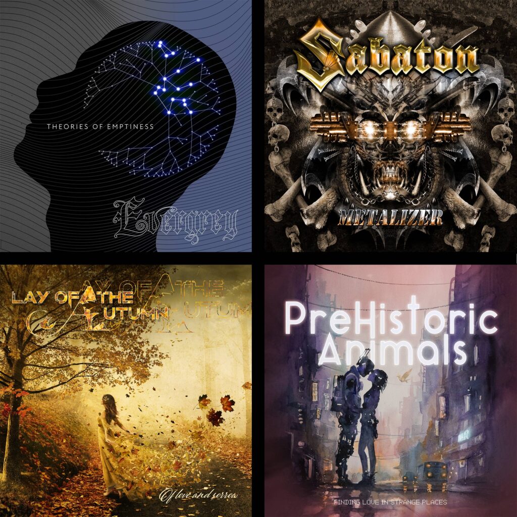
You’ve worked with high-profile artists like Sabaton, John Petrucci, and Evergrey. How do you approach creating artwork for such well-known bands, and how do you balance their vision with your own artistic style?
In the beginning it was perhaps a bit special to work with more famous artists, but you get used to it quite quickly and I have always tried to treat each client and project with the respect they deserve. A debut record for someone can be significantly more important to that person compared to the 15th record of some more famous artist. Everyone deserves maximum effort and I find it extremely difficult to let go of jobs that I myself am not happy with and can stand for. Whether it is a record that will probably sell many thousands of copies or one that may not be printed in more than 100 copies.
Of course, the artist’s vision is always the primary thing, but within that vision I naturally also have to express my ideas if I feel they can lift the artwork a little extra.
A typical example is the latest Evergrey cover. Tom S. Englund and I agreed that it should have a simpler and more stylish design compared to their previous albums. But it was Tom’s idea that it would be THIS minimalistic. And the simple is often the difficult. It took a good while until I found the right design and felt that it was something that I could stand for 100%. It was a fun project because it was really a watershed moment among the fans. Tom wanted to do something completely new and fresh and not just “another Evergrey record“. I respect that a lot. I also respect that he didn’t let the label rule the matter, because they weren’t too keen on the cover to be honest. Personally, I think it holds up really well now that I have lived with it for a while.
Album covers often become iconic representations of a band’s music. Can you walk us through your creative process when designing a cover? Do you listen to the album beforehand to get inspired, or do you work purely from the band’s brief?
It is extremely different from case to case. Sometimes I haven’t heard a note. Sometimes I can enjoy the whole album while creating. Then some bands have a pretty precise picture of what they want, while others say “just do something nice“.
The easiest and most fun projects are usually those where the band or the artist has a SMALL idea that you then can develop in the direction you want. The worst are where the bands have a precise vision down to the level of detail. There it will be more focus on getting all the requests in and the overall feeling of the design will easily suffer in those cases.
In your opinion, how has the role of album art evolved in the digital age, where streaming platforms dominate and physical album sales have declined?
Unfortunately, I was a little late in starting to create covers. At the same time as I started my company, downloading became an increasing concern for the bands. The budget decreased with each album and in the end few wanted to pay reasonably for a cover. What unfortunately not many bands still don’t understand is that the artwork can also be used for merchandise. When record sales decreased, the bands should understand that they have to go other ways to make money. I was at a concert recently with a favorite band of mine and was thinking of buying a T-shirt after the show. Turns out they only had one design, and it was out of stock in the size I wanted. That relatively big bands still miss that chance to make money is actually fascinating… And a little sad.
You’ve now shifted into working as a designer for a book publisher. How does this line of work compare to creating album covers? Do you find any similarities between designing for music and books?
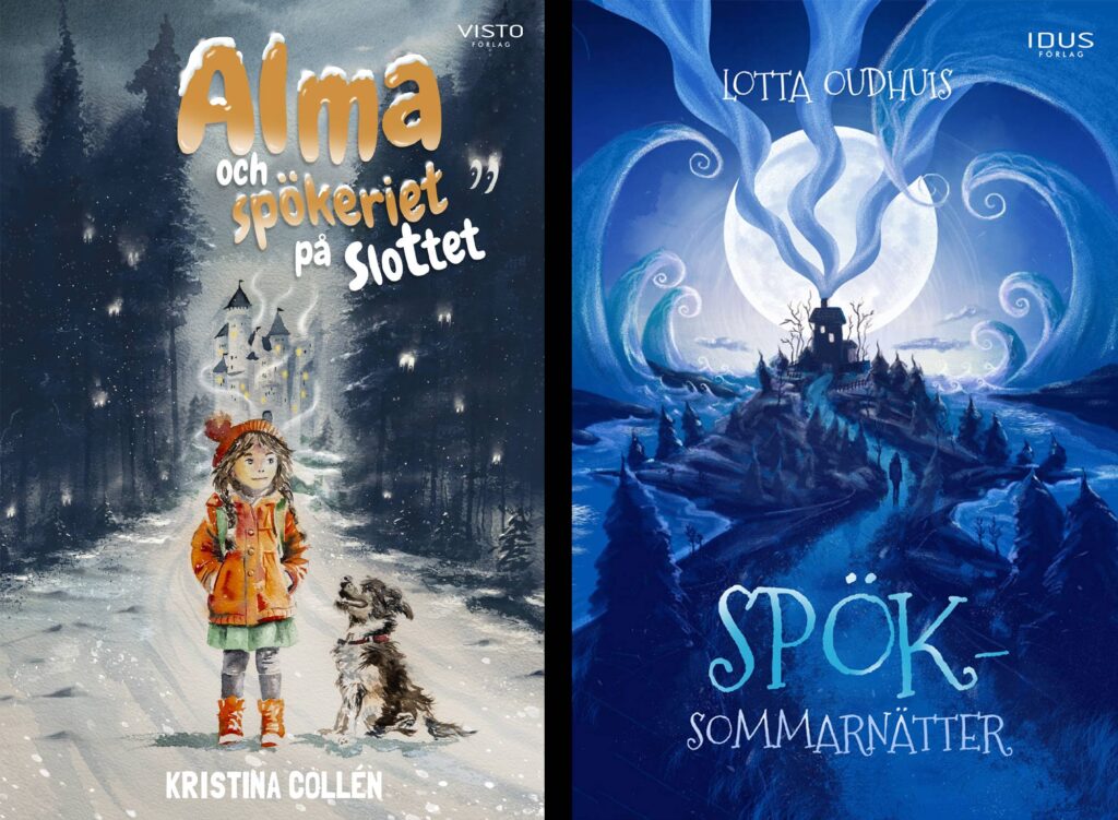
It is a more varied job as there are many different types of books. Everything from picture books for the youngest, where I get all the finished picture material from an illustrator and script from the author and put it together into a nice book, to a long fantasy novel where there is a lot of work with the text and where I also make the cover, which is naturally more like my album cover jobs. I have also worked with books about food and wine where much work goes into making an inviting layout. But on the whole, it’s a very similar mission. You have a writer or a band to try to understand and realize a vision for. The difference is not that big. Although the band often has darker clothes and longer hair. [laughs]
Although you’re focused on your work with the publisher, you still create album covers occasionally. How do you decide which music projects to take on, and what keeps you coming back to this form of design?
I love music and I listen to music far more than I read books, so of course I still love helping bands. It became a bit much during the three years I did it full-time and I probably had a bit of a creative slump there towards the end when you felt you HAD to create a certain amount every month in order to pay the bills. These days I just do it for fun and therefore only take on projects that inspire me. Then of course a good paycheck can work as inspiration as well. [laughs]
Can you tell us more about the book you’ve released? How does it reflect your journey as an artist and designer?
The book was just a crazy idea we had at work one day and I decided to finish it. And then you’ve always wanted to tick off “author” on the bucket list. The book is a humorous book for adults. A small parody of a typical book for the little ones, you could say. It is usually much appreciated to give away as a gift. The title of it is “Point book for Middle Age Heroes”. I don’t think that the term “point book” exists in English but it’s a book for the youngest with just one picture and one word or expression on each page.
Unfortunately, it is only available in Swedish yet.
With such a prolific career, do you have a particular album cover that holds special meaning for you, or one that you consider a personal favorite?
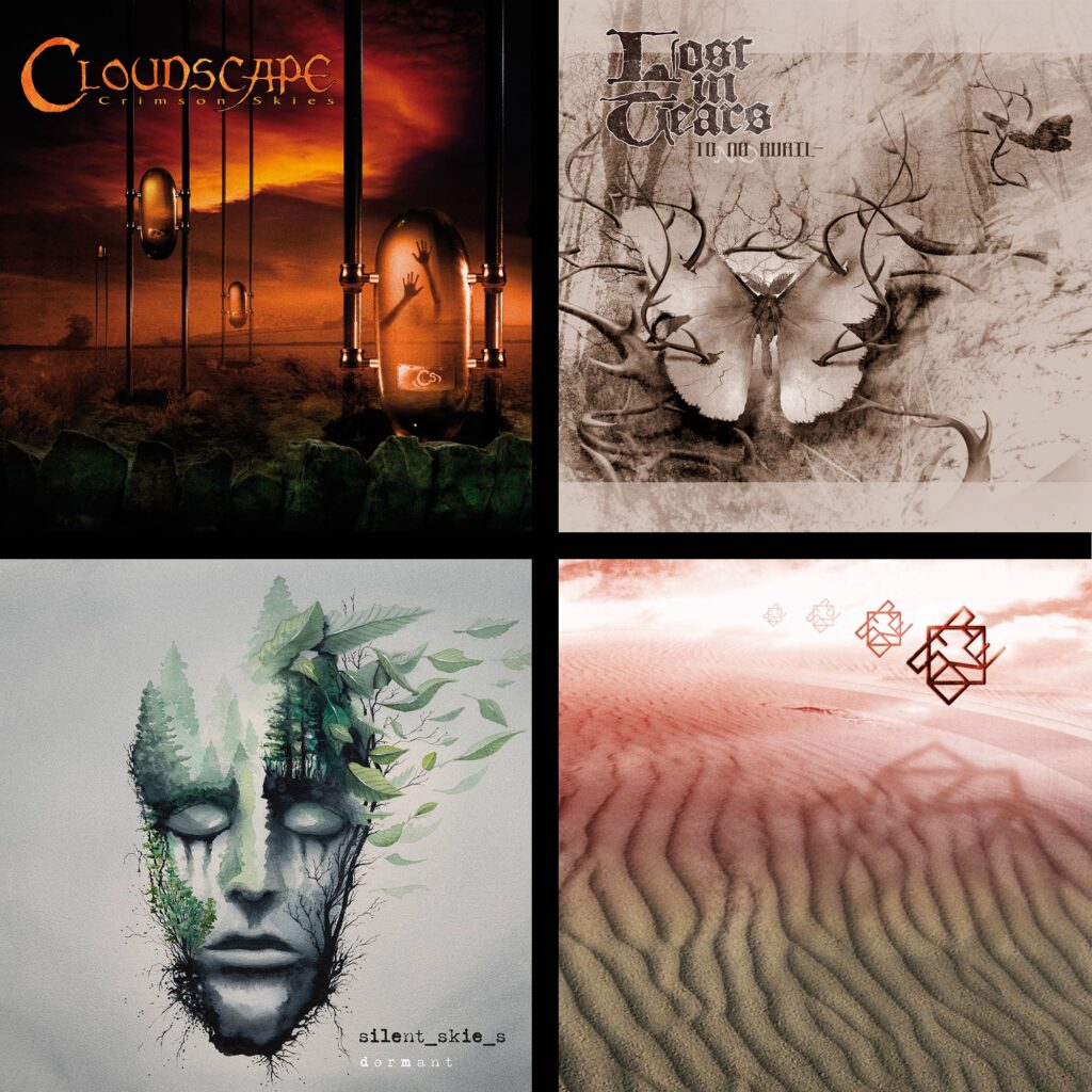
There are many that have meant a lot to me. I have to say that Silent Skies – Dormant was a fantastically rewarding project. The band consists of Tom Englund from Evergrey and Vikram Shankar who has played keyboards with many different bands. It was my very first cover job painted in watercolor. There are many watercolor paintings inside the booklet as well. And I LOVE the record and I had the opportunity to listen to it while I painted. Had some magical creative moments there.
The cover I did for the Finnish band Lost in Tears has also always been a favorite.
The covers I made for the band Cloudscape have been great fun to make as I have had complete freedom to do what I wanted.
And even though I didn’t do the covers, it was great fun to work with layout and booklet illustrations for Arjen Lucassen on Ayreon‘s The Human Equation and Star One‘s Space Metal.
What advice would you give to aspiring graphic designers who want to break into the music industry and work on album covers?
Although I didn’t intend to get into any deeper AI debate in this interview, it’s probably impossible not to mention it. It’s not easy to reach out and get a graphic identity these days when anyone can create the most amazing images with the push of a button. I have to admit that I have been fascinated by the possibilities myself… As surely many others. As an artist I always enjoy trying new things and techniques. But after a while, you just feel an emptiness when you look at AI-created pictures. I have spent much thinking about how to handle AI. Both as a tool and a “competitor”. The result was that I chose to go back and paint more traditionally a couple of years ago. You just have to agree that some special magic is created when the brush meets the paper. Something that I doubt a machine will ever be able to fully replicate, even if it comes close.
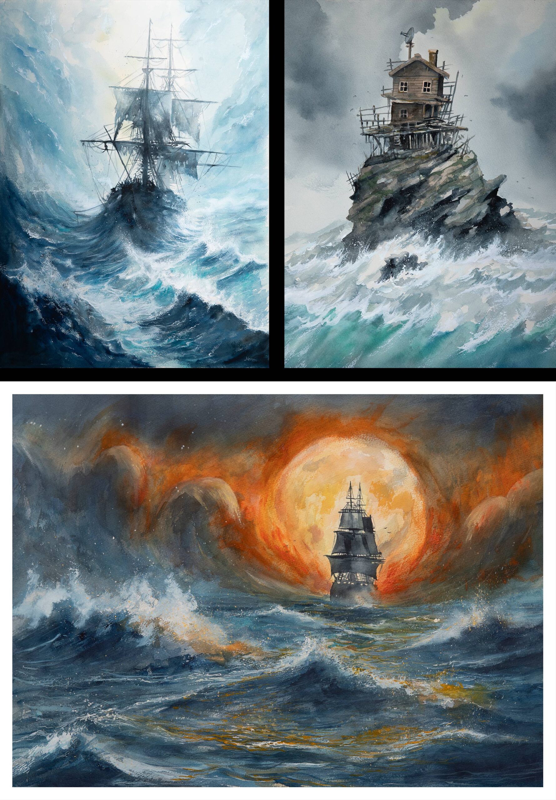
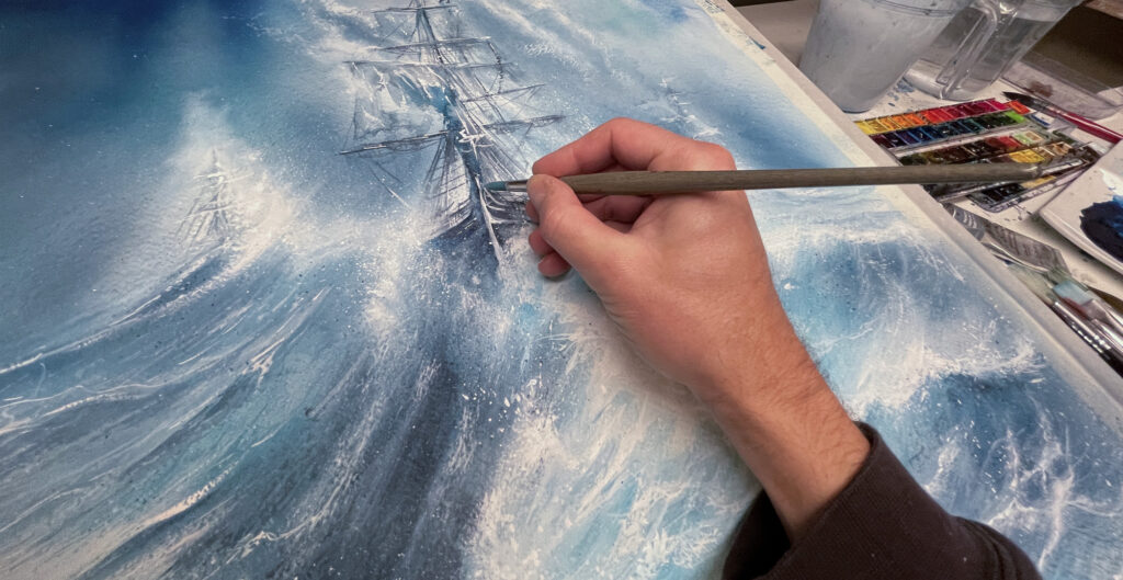
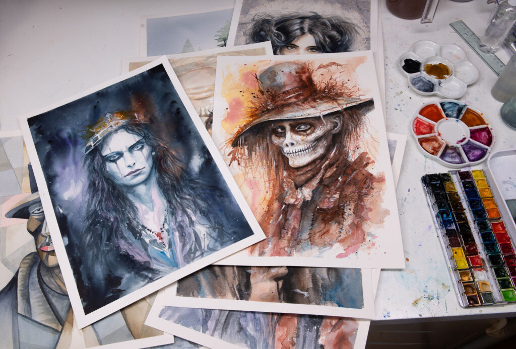
In order to learn to paint watercolor, I went hard and decided to paint no less than 100 watercolor portraits in one year. I managed to do it and I call the collection “The Hundred“. Lately, I’ve been doing several paintings that contain water, as I think it’s both difficult and fun at the same time. I have done a couple of “Tiny Island” and some ships.
When I create a cover today I often paint a picture in the traditional way and then I take it in and post-process it digitally. Then you still get that lovely “authentic” feeling that is missing in many of the covers you see today. But at the same time, you can adjust the image so that you get exactly the feeling and colors you want, and of course correct small details that were not completely successful in the original painting.
Back to AI. I’ve been through enough “tech shifts” to understand that nothing will stop AI so I don’t think there’s any point in shouting. The best thing you can do is try to adapt. Instead of hating those who choose to work with AI, I think that a greater responsibility should be placed on the consumer. The technology is there and it won’t go away. But if you tell your favorite band that their AI-generated cover makes you sick, they might think twice about their next record release.
I believe and hope that it will change soon and that bands will want covers created by people instead of machines. I still want to believe that there is a chance for young skilled artists to break into the music industry.
For more about Mattias Norén and his work, visit his website here. You can also follow him on Facebook and Instagram.

